
Vehicle Simulation Games
My role
UX/UI Designer, Design System Owner
Disciplines
UX Design, UI Design, Workshop Facilitation
Tools
Figma, Photoshop, Illustrator, Claude Code
Project Testimonials
It was my pleasure to work with Tom Tramita as a senior UI Designer.
Tom joined our Game Design team at SCS Software during active development of Euro Truck Simulator 2 and American Truck Simulator. He left a mark that will outlast his time with us.
What distinguished him most was his organizational clarity. Tom has a rare ability to bring structure to complex work without losing the human element - from the precision of his Figma presentations to the way he communicated across disciplines. He overhauled our entire UI Figma library from the ground up, aligning the team around a shared visual language.
His UX/UI workshops were among the most practical and well-received sessions our team has experienced. He made complex design principles accessible not just to designers, but across the whole department. That kind of reach is uncommon.
Tom is a person of high standards who leads through clarity and example. He arrived, understood the landscape quickly, and immediately began building things that mattered. Any team that values craft, precision, and quiet professional excellence will be stronger for having him.
It was our privilege to work alongside him.
Viktor Avdejev
Game Design Lead

Over 20 years of Development
Joining SCS Software meant stepping into products with a remarkable history. Both Euro Truck Simulator 2 and American Truck Simulator are built upon decades of design decisions, feature additions, technical evolution, and player expectations. Every new system, screen, component, and visual update exists within a much larger ecosystem that has been shaped over more than twenty years of development.
Rather than approaching the project as a redesign, I approached it as an exercise in understanding and respecting the existing foundations. My goal was to identify opportunities for improvement while preserving the identity that millions of players already recognize and appreciate.
I began with a comprehensive UX and UI audit covering more than 50 screens, analyzing the experience across multiple levels:
Overall UI art direction
Design system foundations
Component consistency
Panel consistency
Screen-level usability and visual improvements
One of the most interesting challenges was synthesizing the existing visual language into a clearer and more intentional UI direction. By studying the current state of the interface and connecting it to the company's evolving mission and vision, I helped create a framework that explained not only how the UI should look, but why it should look that way.
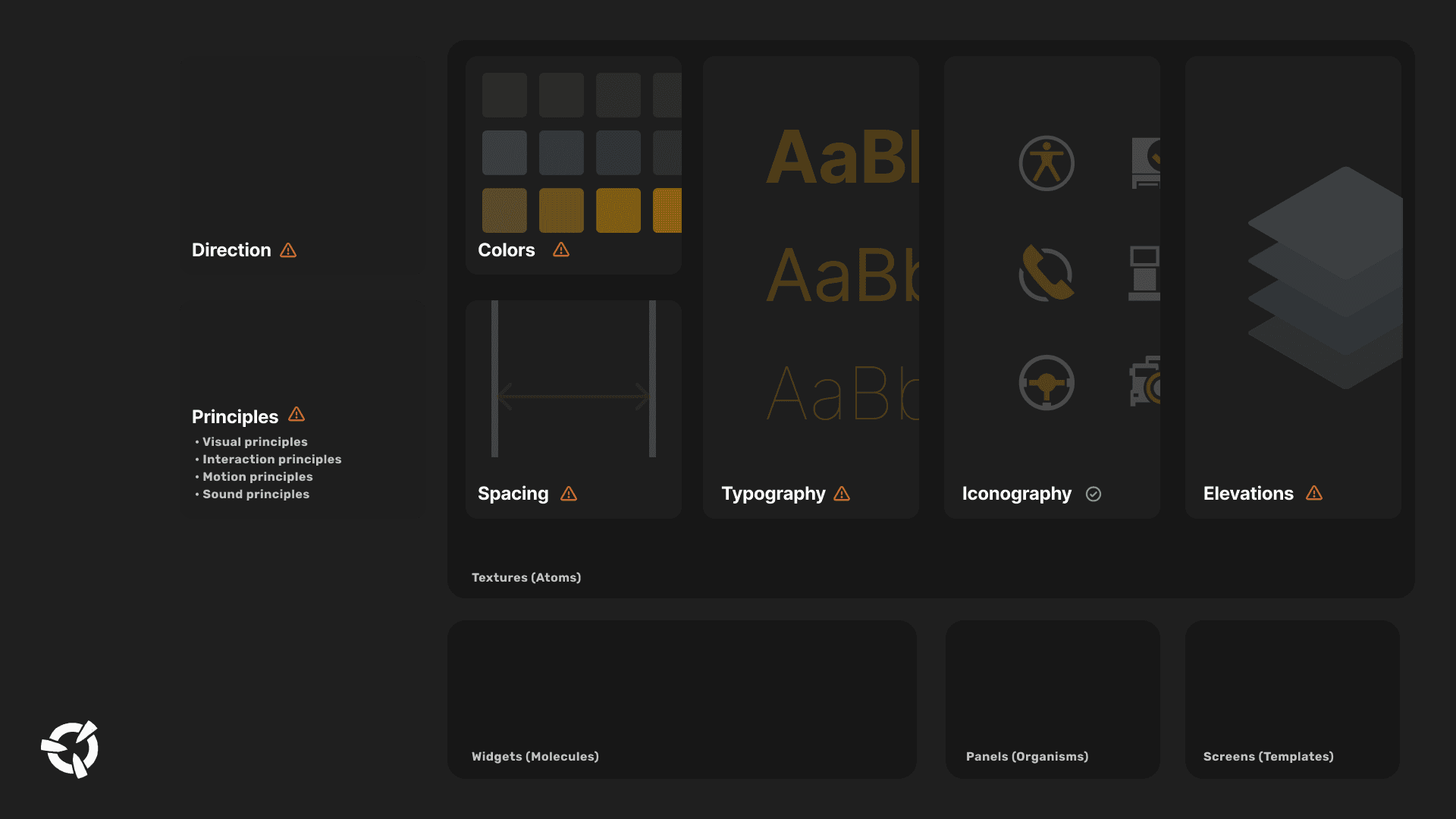
This direction was reviewed and discussed with key stakeholders, including the original creator of many UI elements, external UI specialists, and design leadership. The result was not a replacement of the game's identity, but a clearer articulation of it - one that respected the legacy of the products while creating a stronger foundation for future development.
Projects with this level of history come with significant design debt and complexity. Fortunately, solving complex systems, aligning teams, and bringing structure to evolving products is exactly the type of challenge I enjoy most.
Figma vs Engine vs Ideal State
One of the most important lessons from working on long-running live products is that there are often three different realities:
The Engine State - what players actually experience in-game.
The Figma State - what is documented and available to designers.
The Ideal State - what the experience should become in the future.
Many design initiatives begin by jumping directly to the ideal state. In my experience, this creates unnecessary risk. Before proposing change, it is essential to fully understand the gap between what exists in the engine and what is documented in design tools.
The first objective was therefore to map reality.
I analyzed and reconstructed large parts of the existing UI inside Figma, creating a much more accurate representation of the live game experience. This provided a reliable foundation for future design work and enabled meaningful discussions about improvement opportunities.
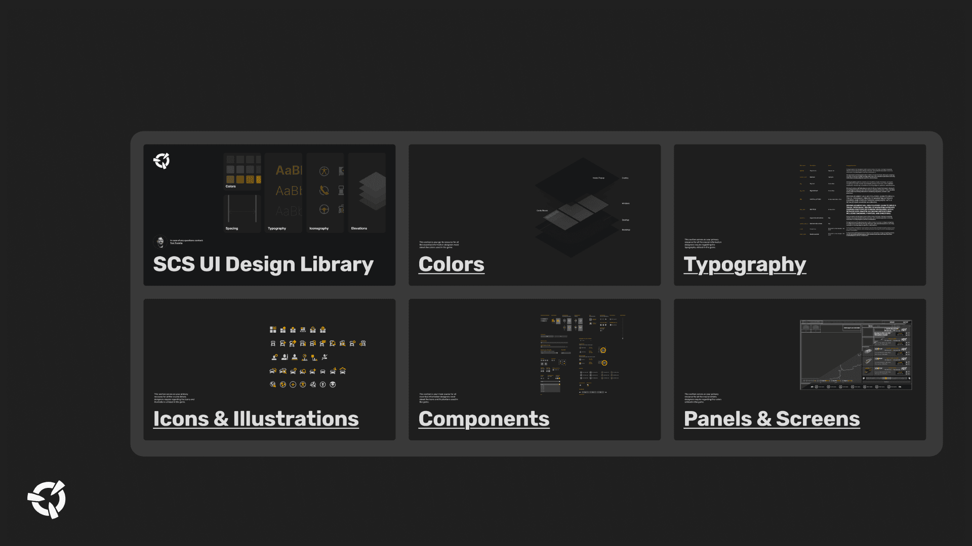
The audit revealed opportunities across the design system foundations:
Typography
Typography was reviewed both in Figma and in-engine. The existing approach proved to be strong and consistent enough to remain largely unchanged, serving as one of the stable foundations of the system.
Colors
The color system had evolved over many years and contained a significant amount of hardcoded semantic usage. To improve maintainability and scalability, I restructured the system by introducing a primitive layer beneath the existing semantic layer and adding an additional designer-facing semantic layer.
This helped simplify the color architecture while making the system easier for designers to understand and use.
Results:
Color definitions reduced from approximately 120 to 80
Clearer hierarchy between primitives, system semantics, and designer semantics
Improved scalability for future feature development
Components
Existing UI components were analyzed, rebuilt, and standardized to support modern design-system practices.
The objective was not only consistency, but flexibility. Components were redesigned to support a wider range of use cases while reducing duplication and maintenance effort.
Results:
Component library streamlined from approximately 60 to 30 components
Improved consistency across screens and panels
Better support for future feature development
Screens and Panels
Many panels and screens were recreated and documented in Figma,. This was one of the most frequently requested needs from game designers and became a key step toward creating a comprehensive design system that accurately reflected the live game.
The ultimate goal was simple:
Create a true 1:1 relationship between Figma and the game whenever possible.
When designers, developers, and stakeholders work from the same source of truth, discussions become faster, implementation becomes more predictable, and future improvements become significantly easier to manage.
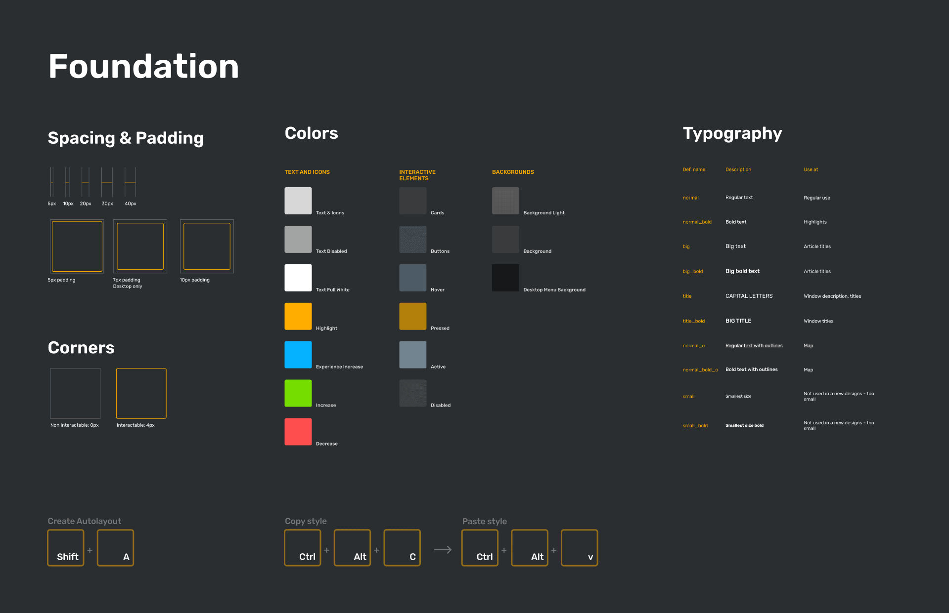
At the end I was able to create one sticker sheet that was part of every Feature template:
Communication and Collaboration
Design systems are often perceived as a collection of colors, typography, and components. In reality, the greatest challenge is rarely the system itself. The challenge is helping people adopt it.
A well-designed system can still fail if teams do not understand its purpose, trust the process behind it, or see how it supports their daily work. This is why communication, stakeholder management, and change facilitation were just as important as the design work itself.
Alongside the UX and UI audits, I also reviewed the feature development process and identified opportunities to strengthen the early stages of game development.
Using the Design Thinking framework as a reference point, two areas stood out:
Empathize
Player insights could be gathered more systematically through structured feedback analysis and modern AI-assisted research techniques, helping teams better understand player needs before feature development begins.
Ideation
Cross-disciplinary brainstorming sessions at feature kickoff could help teams generate stronger ideas, identify risks earlier, and align on goals before moving into production.
To support adoption of both the design-system improvements and process recommendations, I organized and facilitated a series of workshops involving design, QA, and internal tools teams.
Results:
5 workshops conducted
Design team alignment sessions
Internal tools team workshop focused on improving the experience of tools used daily across the company
Final knowledge-sharing sessions covering UX, UI, and Design Thinking principles
I concluded my time at SCS Software by delivering two final workshops focused on Design Thinking and practical UX/UI methodologies, helping teams continue building upon the foundations that had been established.
For me, this project reinforced an important principle:
Successful design transformation is never only about the interface. It is about people, communication, shared understanding, and creating momentum that allows good decisions to continue long after the project itself is finished.
On top of the Design System Development and UX/UI Education I was responsible for visual development of: