UX Design
Function of Design Clarity
Jan 20, 2026
After some years in UX/UI, you start noticing patterns.
When something feels unclear to users, it’s almost never because one screen is badly designed. The typography is fine. The spacing is fine. The hierarchy makes sense. And yet, users hesitate. They slow down. They retry. They fail.
What’s actually breaking is not the screen, it’s the flow. At some point, I stopped asking “Is this screen clear?” and started asking a more uncomfortable question: How efficiently can users successfully move through this sequence of actions? That shift changed how I evaluate design and how I explain clarity to others.
Why clarity usually shows up too late
Most clarity problems don’t appear during design reviews. They show up later:
in usability studies
in playtests
in support tickets
in analytics
That’s because clarity is not a static quality. It only reveals itself over time, while users are actually doing things. You can ship a visually clean interface that still feels confusing because the user keeps losing momentum. Design doesn’t live in isolation. It lives inside a sequence of actions.
Thinking in flows, not screens
When I look at mature products especially complex ones I rarely see a single “bad” screen. What I see instead:
one action that takes slightly too long
another that fails more often than expected
a third that forces users to stop and think
Individually, each screen is fine. Together, the experience starts to feel heavy. That’s why I’ve started thinking about design clarity as something closer to a rate, not a property.
A simple to describe clarity now
This is the mental model I use:
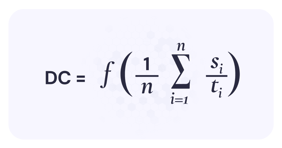
Where:
si = whether an action was successful (1 or 0)
ti = how long that action took
summed across the entire flow
When translated: Design clarity is how many successful actions users complete per unit of time. That’s it. No weighting. No scoring system. No dashboards. Just: Did they succeed, and how long did it take?
Why this resonates with real work
I like this formulation because it mirrors what actually happens in practice. Failed actions matter naturally A failed action doesn’t need special punishment. It already hurts clarity:
it takes time
it adds zero success
That’s exactly how users experience it. Users rarely say, “This design lacks clarity.” They hesitate. They pause. They backtrack. Time exposes that immediately. You can’t apply this to a single screen without cheating. You need a flow. That alone already improves most design conversations.
Imagine a simple five-step flow:
Action | Success | Time |
|---|---|---|
1 | 1 | 4s |
2 | 1 | 6s |
3 | 0 | 8s |
4 | 1 | 5s |
5 | 1 | 4s |
Total:
4 successful actions
27 seconds
DC=427≈0.148DC = \frac{4}{27} \approx 0.148DC=274≈0.148
Now compare that to a tighter flow with no failures and faster pacing. You don’t need UX copy to explain which one feels clearer.
Where this thinking helped me most
This way of looking at clarity has been especially useful in:
complex products with long task chains
games and interactive systems
AI-driven interfaces where rules are still forming
AI tools are a great example. You can design a beautiful interface, but if users:
fail prompts
retry repeatedly
slow down to “figure out how to talk to it”
…clarity is low, no matter how polished it looks. This model helps separate visual confidence from interaction clarity.
Important limitation (and why I’m fine with it)
This approach treats all actions equally. It ignores, emotional weight, business importance, perceived value. That’s intentional. In my experience, once clarity collapses, nothing else really matters. Users can’t appreciate value if they can’t move forward smoothly. You can always layer importance later. But clarity has to exist first.
One mindset shift that matters
The biggest change for me was this:
Clarity doesn’t affect flows.
Clarity is affected by flows.
You don’t add clarity by polishing a screen. You earn it by letting users succeed, continuously, without unnecessary delay. Once you start evaluating design this way, a lot of things become obvious:
why some “ugly” products work well
why some beautiful redesigns fail
why small frictions compound over time
Why I’m sharing this
After years, I’m less interested in frameworks that sound smart and more interested in tools that actually help me reason about work. This is one of those tools. It’s not perfect. It’s not complete. But it’s practical, easy to explain, and grounded in how users actually behave. And sometimes, that’s exactly what you need: not another checklist, but a better lens.