UI Design
Future-Proofing Your Colors (and Sanity)
Feb 10, 2026
Ever had a stakeholder ask, "Can we make all the primary buttons slightly more electric blue?" and felt a cold sweat because you knew you’d have to find and replace that color in 400 different files? We’re going to talk about the two-layer token system that turns that week-long nightmare into a five-minute task.
Let’s talk about variables. In design systems, we call them "Design Tokens," but really, they are just nicknames for values like hex codes, spacing, or font sizes.
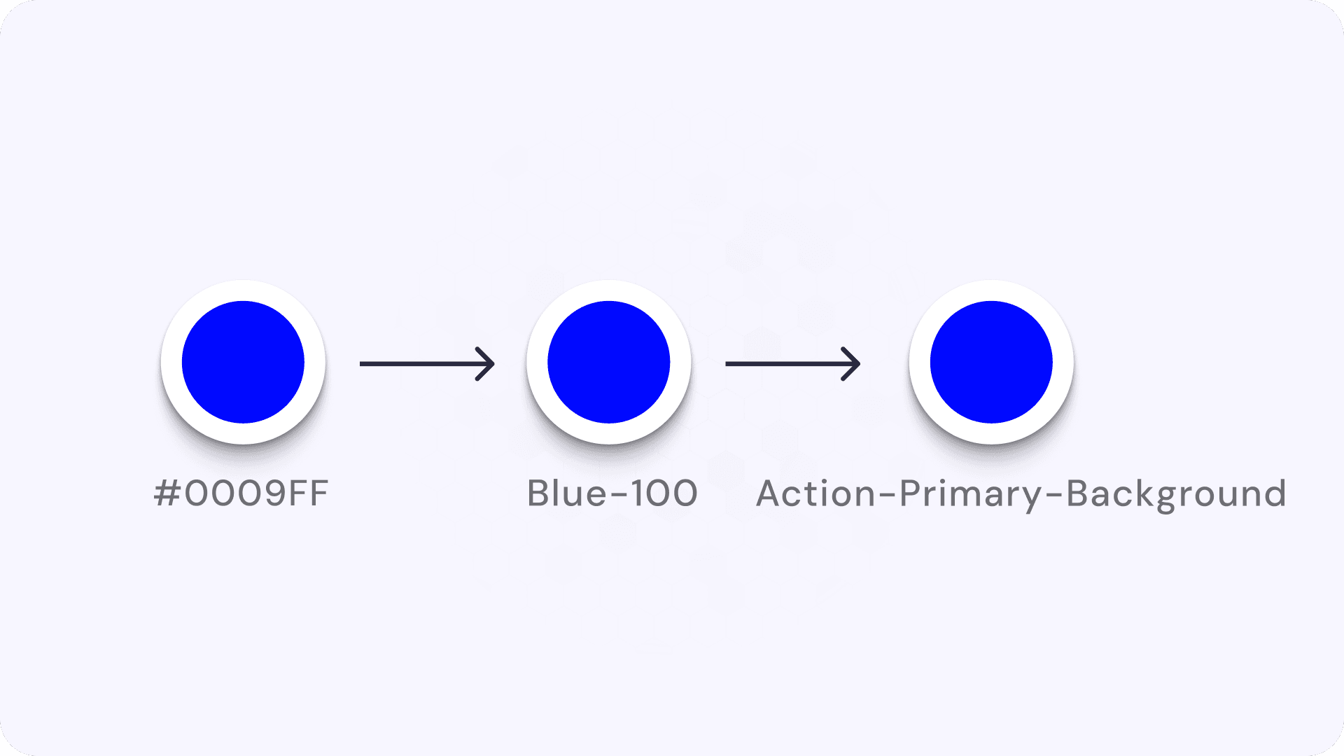
When you start a new design system, the temptation is to keep it simple. You pick a nice blue, maybe #0009FF, and you name it Blue-100. You start using Blue-100 everywhere. It’s on your buttons, your links, your toggle switches, and that little notification dot.
This is what we call a Primitive Token (or a Global Token). It describes what the thing is. It is blue.
But then, the inevitable happens. The brand team decides that "Blue" is out and "Teal" is in. Or, even more common, you need to build "Dark Mode."
If you used Blue-100 for your text links and also for your button backgrounds, you are in trouble. In Dark Mode, you might want the button to stay bright blue, but the text link needs to be lighter so it’s readable against a dark background. If both of them are just pointing to the same Blue-100 token, you can't change one without changing the other. You are stuck.
This is where the second layer comes in: Semantic Tokens (or Alias Tokens).
Semantic tokens describe what the value is used for, not what it looks like. Instead of applying Blue-100 directly to a button, you create a new token called Action-Primary-Background and map that to Blue-100.
It looks like unnecessary extra work at first. You are basically creating a redirect: #0009FF → Blue-100 → Text-Highlight.
But here is the magic.
Imagine you need to create a "High Contrast" mode for accessibility.
Without Semantic Tokens: You have to hunt down every instance of
Blue-100and manually decide if it needs to change.With Semantic Tokens: You just go to your token list. You tell
Action-Primary-Backgroundto stop pointing atBlue-500and start pointing atBlue-100(a darker, higher contrast blue). Instantly, every primary button in your entire app updates, but your decorative blue icons (which might use a different semantic token likeIcon-Decorative) stay the same.
Think of it like cooking.
Primitive Token: "Sugar." (Raw ingredient)
Semantic Token: "Sweetener for Coffee." (Context)
Component: "Morning Coffee." (Final product)
If you run out of Sugar, you can swap the "Sweetener for Coffee" to Stevia without ruining your "Spicy BBQ Rub," which also uses Sugar. If you just used "Sugar" for everything, swapping it would ruin your BBQ.
So to wrap it up:
Primitives (Global): The raw palette. Names like
Blue-100,Space-16px. They represent the options you have.Semantics (Alias): The context. Names like
Text-Link,Surface-Background,Border-Error. They represent the decisions you made.The Benefit: You can rebrand, theme, or fix accessibility issues by changing the mapping, not the design files.
Go look at your current design file. Click on a "Delete" button. Is the color named Red-100? If so, you are at risk. Try creating a local variable called Background-Destructive and link it to that red. Now, if you ever want your delete buttons to be orange instead of red, you only have to change it in one place.